The National Snow and Ice Data Center warned on August 11th that the North Pole is melting:
The pace of sea ice loss sharply quickened in the past ten days, triggered by a series of strong storms that broke up thin ice in the Beaufort and Chukchi Seas. Amundsen's historic Northwest Passage is opening up; the wider and deeper route through Parry Channel is currently still clogged with ice.Sounds alaming? Maybe--but it's wrong, says Steven Goddard in the August 15th UK Register:
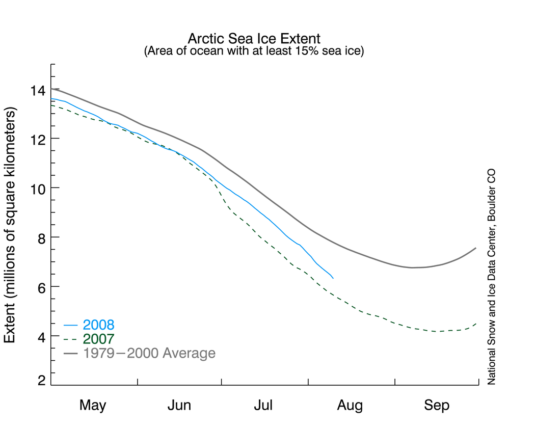
source: NSIDC

Their [NSIDC] data shows Arctic sea ice extent only 10 per cent greater than this date in 2007, and the second lowest on record. . . . The problem is that this graph does not appear to be correct. Other data sources show Arctic ice having made a nice recovery this summer. NASA Marshall Space Flight Center data shows 2008 ice nearly identical to 2002, 2005 and 2006. Maps of Arctic ice extent are readily available from several sources, including the University of Illinois, which keeps a daily archive for the last 30 years. A comparison of these maps (derived from NSIDC data) below shows that Arctic ice extent was 30 per cent greater on August 11, 2008 than it was on the August 12, 2007. (2008 is a leap year, so the dates are offset by one.)Good question. Commenters on a Watts Up With That? post are debating the answer.
source: UK Register via University of Illinois
The 30 per cent increase was calculated by counting pixels which contain colors representing ice. This is a conservative calculation, because of the map projection used. As the ice expands away from the pole, each new pixel represents a larger area - so the net effect is that the calculated 30 per cent increase is actually on the low side.
So how did NSIDC calculate a 10 per cent increase over 2007? Their graph appears to disagree with the maps by a factor of three (10 per cent vs. 30 per cent) - hardly a trivial discrepancy.

MORE:
Goddard now agrees with NSIDC:
"Dr. Walt Meier at NSIDC has convinced me this week that their ice extent numbers are solid. So why the large discrepancy between their graphs and the UIUC maps? I went back and compared UIUC maps vs. NASA satellite photos from the same dates last summer. It turns out that the older UIUC maps had underrepresented the amount of low concentration ice in several regions of the Arctic. This summer, their maps do not have that same error. As a result, UIUC maps show a much greater increase in the amount of ice this year than does NSIDC. And thus the explanation of the discrepancy.
"it is clear that the NSIDC graph is correct, and that 2008 Arctic ice is barely 10% above last year - just as NSIDC had stated."
4 comments:
.
> So how did NSIDC calculate a 10 per cent increase over 2007? Their graph appears to disagree with the maps by a factor of three (10 per cent vs. 30 per cent) - hardly a trivial discrepancy.
I vote for "They made it up out of whole cloth".
Would not be the first time.
What would YOU do to 'SAVE the planet'?
Almost anything can be justified when that's your premise.
We are witnessing the first secular religion, the substitution of environmentalism for traditional faith in God.
Man MUST have something larger than himself and if God is non-existent, they WILL find his replacement.
Looking at environmental extremism through the lens of religious fanaticism explains all one needs to know about 'global warmings' advocates.
I agree. And I don't think it an accident that the global fascistic church of environmentalism launched just when Marxist-Leninism became discredited in about 1990.
>>I vote for "They made it up out of whole cloth".<<
Nah, Steven Goddard has since admitted he was wrong - read the last update to his article.
Post a Comment