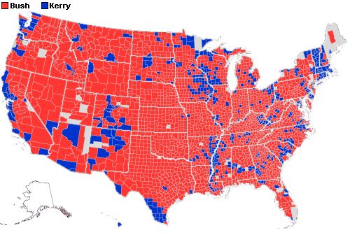
2004 Presidential Vote, County-by-County (click to enlarge)
Compare the same map four years ago:

2000 Presidential Vote, County-by-County (click to enlarge)
(via The Corner)
More:
A Princeton University map. It's red, blue and purple; the shading shows the strength of the party in each county:
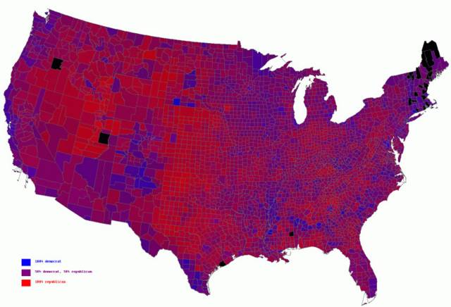
2004 Presidential Vote, County-by-County, with shading (click to enlarge)
Seems like good nuance. An analysis of the map by William J. Stuntz at Tech Central:
Democrats aren't likely to win when they can't top Dukakis in the Midwest. And this is a moving target. Bush won Missouri in 2000; this time, he won Missouri and Iowa. With similar candidates in 2008, the Republicans might win all four. Ohio could be the least of the Democrats' problems.(via Instapundit)
Still More:
Yahoo's map, with updated vote totals.
More and More:
Michael Gastner, Cosma Shalizi and Mark Newman of the University of Michigan have a collection of maps including ones weighted by population.
1 comment:
I dont know dude....steers n queers? hehehe. Im not from here originally *kak*
Post a Comment